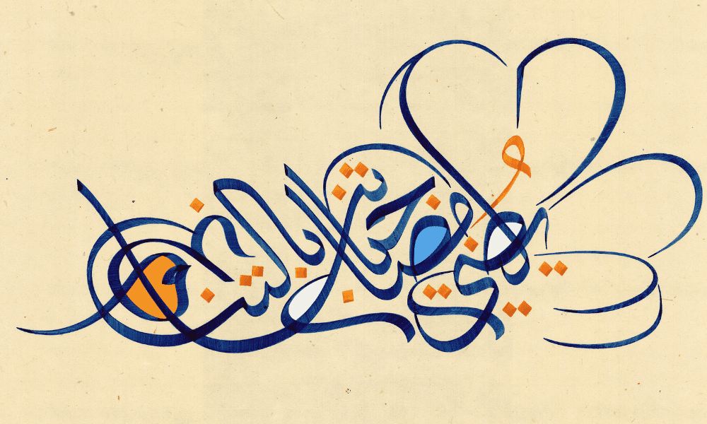
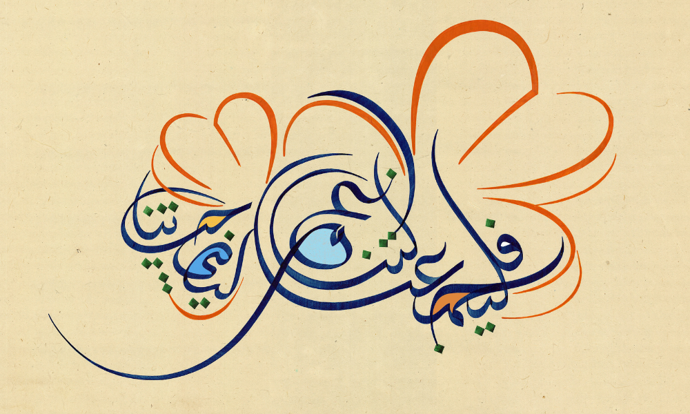
Continuing Van Cleef & Arpels’ commitment to recognising local talent and expressing its interest in education, art and creation, the Maison has partnered up with Saudi calligraphy artist Majid Al Yousef for Ramadan. Adding a contemporary twist to the traditional Arabic art form, the artist brings together several messages of positivity, harmony and the joyous occasion surrounding Ramadan and Eid, all whilst reflecting Van Cleef & Arpels’ spirit of nature and essence of life.
Titled Harmony in Bloom, the collaborative pieces of artwork are intricately seen through the illustrative techniques that he does to highlight the Maison’s Frivole flower. Through vivid brushstrokes and asymmetric reconstruction, Majid also looked to the terms harmony, light and renewal, permitting him to decompose and then rearrange to convey the ideas of aesthetics, motion and geometrical fluidity.
Below, BURO. Middle East sat down with the master calligraphist to discuss his take on the Frivole flower, what makes his presentation of calligraphy different to others and if the art form itself appeals to a younger generation.
Thank you so much for taking the time to speak to us. Can you tell us more about your partnership with Van Cleef & Arpels? How did it start?
Thank you for having me. I met with Van Cleef & Arpels about a year and a half ago. They presented their idea of collaborating with calligraphy artists from the region which started a couple of years before that as a part of their activities that reach out to the local community. They were interested to know more about my practice and style which they found to be in tune with what the Maison is looking for from such a partnership. So, we decided to start working on it by the end of 2021 and launch it in Ramadan 2022.
For your Ramadan collaboration with the Maison, how did you achieve expressing your artwork with codes of the brand?
I started by studying their most iconic designs and visual style. The objective was to find the parts of the designs that can translate into calligraphic forms and vice-versa; working on stylising calligraphy to form an outline of a jewellery piece. The item I was inspired by was the Frivole flower, as it has a very distinctive character, a solid form yet soft and simple.
I worked on making a composition that intertwines the Arabic letters with the Frivole flower outline. This approach at its core embedded the value of harmony and togetherness, some of the codes the brand aims to communicate through this collaboration. After that, I worked on the colours. The colour palette was derived from the artwork colours you see in the boutique, but for the calligraphy part, I had to mix different inks formula to get these colours correctly.
Your artwork offers a harmonious take on the Frivole flower. Can you talk us through the art process of your piece?
I was looking at different photos of the Frivole flower pieces and even checking the actual pieces on display. As I was looking at the pieces from different angles, I noticed that the sharp reflection of light coming out from the edges resembles the strokes that the calligraphy pen makes. So I started sketching the Frivole flower shape using a calligraphy pen and ink and adjusting the angle of the pen until I achieved the right form that blends smoothly with actual calligraphy.
Flowers have been a historic source of inspiration to Van Cleef & Arpels. What do flowers represent to you?
Flowers represent continuous motion, dynamism, and transformation. They change shape and have multiple colours, different sizes and mechanics. That is very intriguing. My work is inspired by continuous motion and change.
What makes your approach to presentations of calligraphy different than others?
A few factors actually; I came from very thorough experience in classical calligraphy which requires a great deal of discipline and skill-building. After many years of practice, I mastered some of the most demanding and intricate calligraphy styles (called Thuluth) among very few calligraphists worldwide, so I appreciate the value of craftsmanship along with creativity. Then I took that into new territory by utilizing calligraphy forms to make abstract art while preserving their inner aesthetic values.
Each letter in Arabic can be a stand-alone piece of art. I merged some concepts from cubism and futurism philosophy into Arabic calligraphy. So, you can see a lot of movement, energy, dynamic scale, and perspectives in the artwork. Though my process is highly technical, I try to make the final artwork look as if it has a flavour of improvisation.
My works are reaching the limit and moving past it. It’s like when geometry moved from Euclidian space into the elliptical and hyperbolic. That approach led me to discover new patterns, entangled forms, and hidden symmetry.
Do you think calligraphy as an art form appeal to the younger generation?
Yes, it does, but the way it is communicated to the younger generation needs to be refined and developed. We have a lot of audiences who like calligraphy but hardly know much about it which makes it very fragile and almost empty of its rich legacy and potential. Besides being part of the art world, calligraphy is important for typography, logotype, and type design. It should be an essential part of the graphic design practice.
Also read: Van Cleef & Arpels and Alexandre Benjamin Navet team up for an artistic collaboration this Ramadan.
