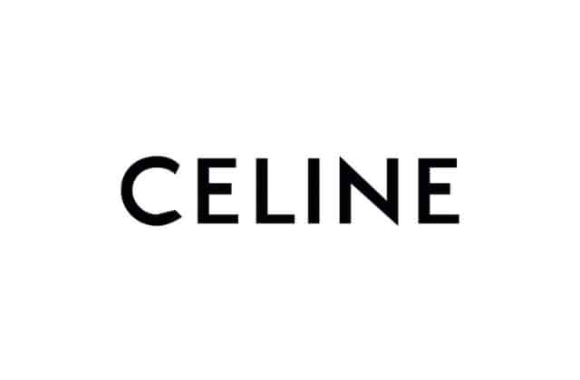
When a new designer takes the helm at a house, in addition to revamping the house’s clothing and accessories collections, the designer may also choose to update its logo. This year, we’ve seen that happen with Riccardo Tisci at Burberry and now, Hedi Slimane has unveiled a new logo for Celine.
It’s an understated design change, with the biggest difference apparent in the spelling of the house’s name: namely, that the accent on the ‘e’ has been dropped. According to a release, this is to “enable a simplified and more balanced proportion, evoking the Celine collections of the 1960s where the accent wasn’t used often.”
In fact, the new logo is a nod to that era as it was “directly inspired by the original, historical version that existed in the 1960s” whereas the typography used comes from the 1930s. The letters have been more closely aligned, too.
The changes are in line with the unveiling of Slimane’s first handbag for the brand which has a distinctly more vintage feel than the house’s previous designs under Phoebe Philo.
According to the brand, the use of ‘Paris’ will be brought back on packaging, too, (as in Celine Paris) but will not appear in advertising campaigns.
The logo was unveiled on Instagram this morning, with the rest of the account wiped clean, save for three videos of the new logo design.
Hedi famously changed Saint Laurent’s logo during his tenure at the brand, dropping the Yves from the brand name all together.
What does all this mean for the clothing collection we wonder? With just under four weeks until PFW, there’s not long until we find out.
In the meantime, find out which designer will close out NYFW for the first time.


