Following in the footsteps of many luxury labels that have reimagined their image including Balmain, Burberry and Celine, Zara is now next.
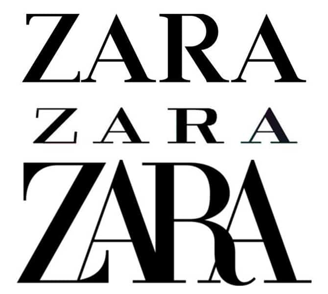
Our favourite fast-fashion retailer has received a brand new logo and it marks the second time the brand has evolved its typography since its 45-year history (previously changing the logo in 2010).
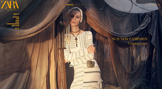
Unexpectedly, the Spanish (Inditex-owned) brand replaced its simple and equally-spaced ZARA logo to a brand new look that involves cursive lettering, drop shadows and overlapping. It officially made its debut on Zara’s new boho-inspired campaign captured by Steven Meisel.
How do we feel? Well, the internet isn’t loving it, that’s for sure…
Consumers are not on board with the logo’s cramped letters, whcih was designed by Baron & Baron. The accentuated curves to the ‘Z’ and ‘R’ make the text slightly difficult to read.
Will the brand be changing it back to the original or will we have to accept the new logo? We’ll just have to find out…
Now, take a look at which musician just launched his own fashion line.


