Loewe has quietly rewritten its visual signature. No fireworks, no shock-and-awe reveal. Just a precise, deliberate shift that signals a new chapter without shouting about it.
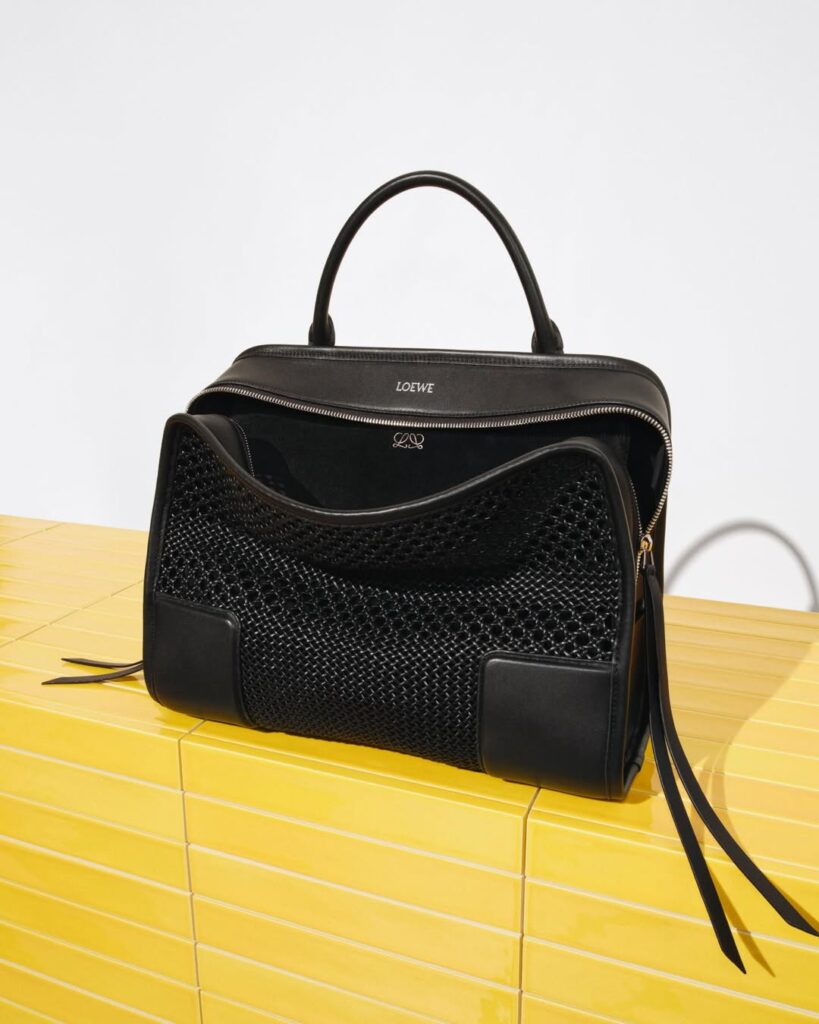
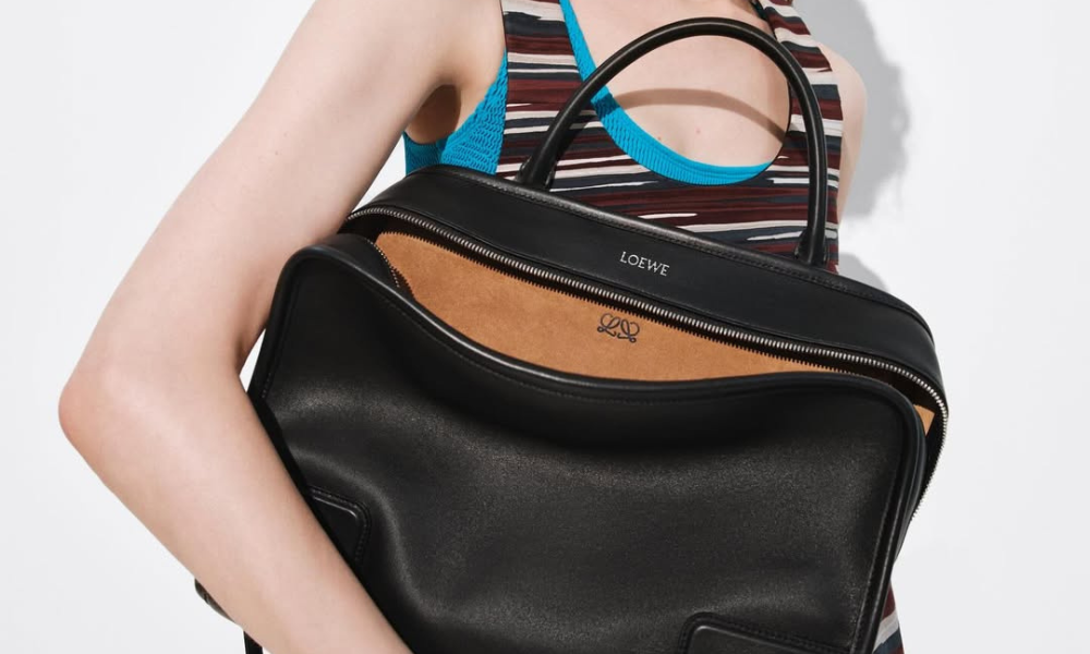
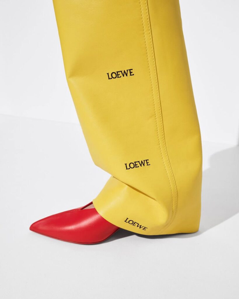
With Loewe entering a fresh creative phase under Jack McCollough and Lazaro Hernandez, the house has started exactly where it should: the logo. The iconic four-pronged anagram, one of fashion’s most recognizable symbols, has been refined into a slimmer, two-part mark. The lower half is gone. What remains feels intentional, confident, and unmistakably modern.
By stripping back the anagram rather than replacing it entirely, Loewe makes its point clearly. Heritage is still the foundation, but it is being sharpened for what comes next. The new logo reads cleaner on screen, stronger at small scale, and far more aligned with how luxury lives today across digital platforms, packaging, and global campaigns.
In fashion, logos are loaded territory. They carry decades of memory, loyalty, and cultural weight. Changing one is often the most telling move a creative director can make, especially at the beginning.
There is also a quiet intelligence to the timing. Luxury brands are increasingly dialing back visual noise, favoring clarity and precision over excess. This update places Loewe squarely in that conversation, without chasing minimalism for its own sake. The anagram still feels unmistakably Loewe. It just breathes better now.
What makes this shift compelling is how little it tries to convince you. No manifesto required. No nostalgia-heavy storytelling. The logo does the work on its own. It acknowledges the past, cleans up the present, and leaves space for what is coming next.
In an industry where first moves are often loud and polarizing, Loewe’s new logo feels like a quiet flex. Subtle, considered, and very deliberate. Sometimes, the smartest statement is the one that does not need to announce itself.