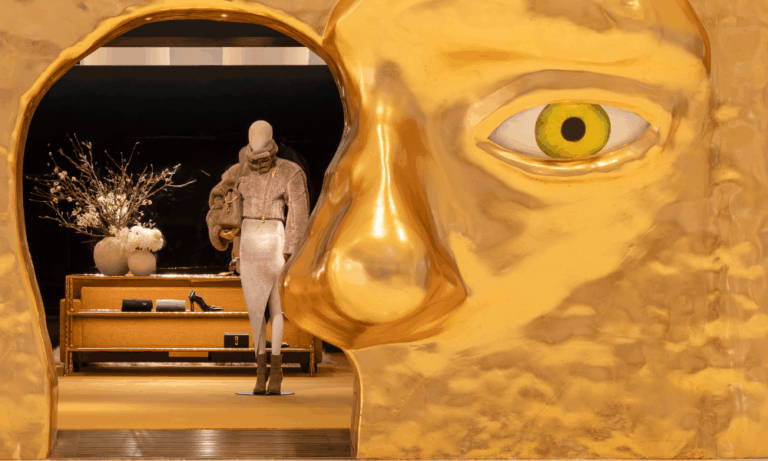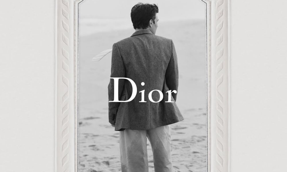
In fashion, even the smallest details can carry monumental meaning. At Dior, that detail is now the logo. Jonathan Anderson has taken the reigns of the French Maison and he is making his presence felt, down to the tiniest details. When it comes to the iconic Dior logo, Anderson chosen not to invent something new but to restore the house’s earliest emblem, a decision that reverberates far beyond typography. It is a gesture of respect, continuity, and cultural memory that situates Dior firmly within its own lineage while quietly resisting fashion’s obsession with constant reinvention.
The move marks a farewell to the all-caps logo. In its place comes a return to Christian Dior’s original typeface, first chosen in 1946. At the time, Dior’s sister, Catherine selected a distinctly French typeface, rare in an era dominated by English and Dutch fonts. Its origins trace back to Charles-Nicolas Cochin, an 18th-century French engraver whose work embodied both precision and artistry. By reviving it, Anderson not only reclaims a piece of Dior’s founding identity but also anchors the brand in a uniquely French heritage that has always been central to its mythology.
This is not a sterile reproduction. Anderson was insistent that the logo retain the imperfections of its original woodblock form — the blops, edges, and irregularities that once gave it character. “I wanted it square,” he explained, emphasizing proportion and balance, “equal on all sides.” The result is a letterform that feels both familiar and raw, its beauty lying in its flaws. In an industry often defined by digital polish, the embrace of imperfection feels radical.
There is symbolism in the design itself. The single large “D,” now dominant, draws the eye immediately, anchoring the name with weight and authority. It is a statement of intent. By amplifying the D, Anderson underscores Dior’s stature as a cornerstone of French couture — immovable, recognizable, enduring.
What makes this change powerful is not novelty, but memory. The decision to revive the old logo situates Dior within its founding moment, reminding us that heritage can be more radical than innovation. At a time when logos are treated as interchangeable branding devices, here is one that insists on being an artifact of culture.
Anderson calls this “step one,” a phrase that hints at larger ambitions. The logo is not an end but a beginning, a symbolic reset before what’s to come. In reclaiming the typeface chosen by Christian Dior himself, Anderson uses the brand’s legacy to chart its future.
In the end, this tribute is less about graphic design than about identity. By restoring Dior’s historic mark, Jonathan Anderson has given the house a reminder of what it has always been.
ALSO READ: NICOLE KIDMAN & KEITH URBAN’S CURTAIN FALL!