Color forecasting has become less about gut instinct and more about patterns. Pinterest’s annual color report draws from observable shifts in how people explore visual ideas on the platform, surfacing hues that are gaining momentum across fashion, beauty, and interiors. The 2026 palette reflects how taste is moving right now, revealing a collective turn toward color that feels expressive, intentional, and emotionally charged rather than purely decorative.
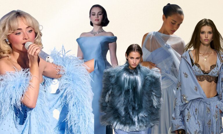
COOL BLUE
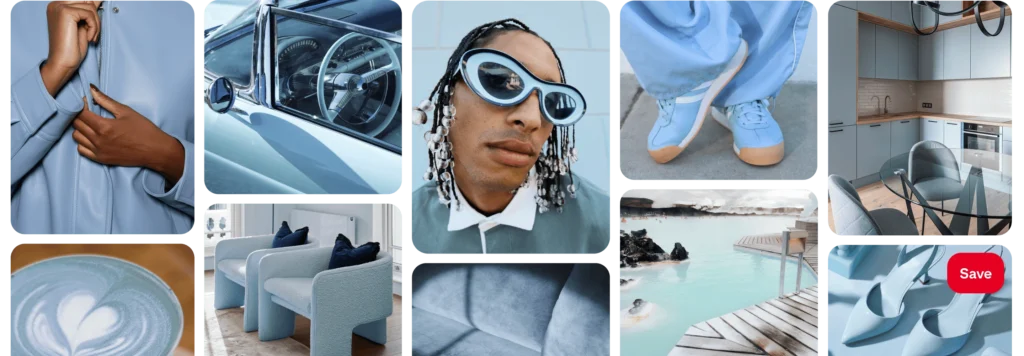
Cool Blue is a pale, icy shade that feels clean and contemporary, offering visual calm without reading as flat or clinical. This blue suggests a preference for simplicity and space, a tone that feels steady and composed in contrast to louder, more saturated colors.
JADE
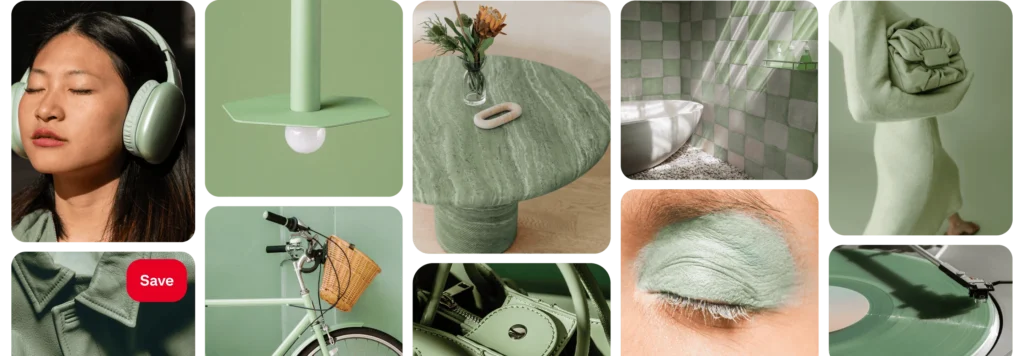
Jade brings softness and balance to the palette. Sitting between green and gray, it feels grounded and elegant rather than overtly fresh or earthy. There’s a sense of quiet refinement to this shade, signaling a shift toward colors that feel calming but still carry depth and character.
PLUM NOIR
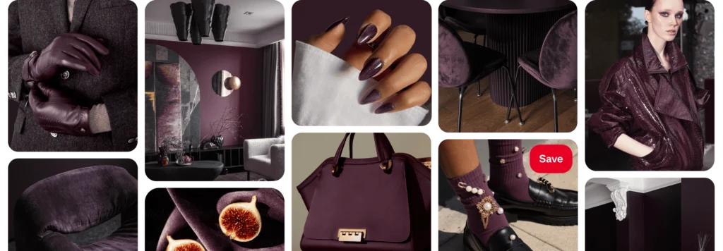
Plum Noir introduces a darker, more dramatic register. Rich and saturated, it blends deep purple with brown undertones, creating a color that feels weighty and intentional. This shade points to a growing interest in moodier palettes that feel expressive, confident, and emotionally resonant.
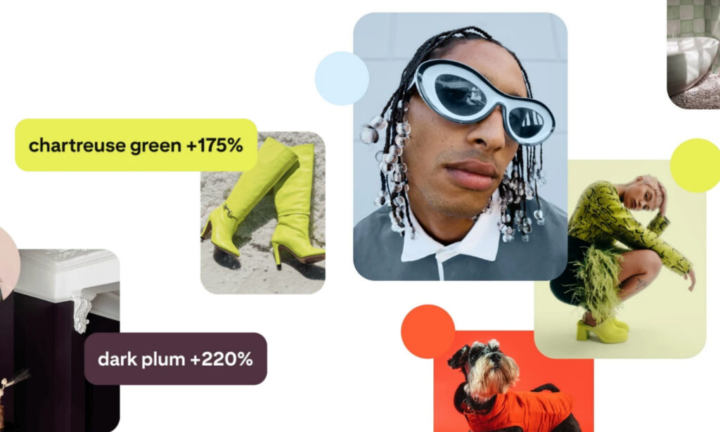
WASABI
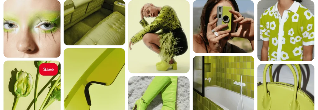
Wasabi is sharp, vivid, and impossible to overlook. This bright yellow-green brings a jolt of energy to the forecast, reflecting a move toward bolder, more playful color choices. It suggests a willingness to experiment and embrace colors that feel lively and slightly disruptive.
PERSIMMON
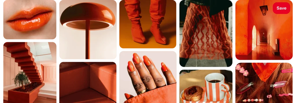
Persimmon rounds out the palette with warmth and brightness. Positioned between orange and red, it feels optimistic and energetic without tipping into excess. This shade captures a desire for color that feels joyful and dynamic, offering contrast to the cooler and darker tones in the lineup.
Together, these five colors paint a picture of where visual culture is heading in 2026. The palette balances calm with intensity, softness with boldness, and restraint with expression. Rather than chasing extremes, it reflects a broader appetite for color that feels considered, personal, and emotionally aware.
ALSO READ: WOULD YOU INVEST IN COLOR-CHANGING HANDBAGS?