The Burberry check was never meant to be seen. Introduced in the 1920s as a lining for the brand’s trench coats, it lived on the inside, a quiet marker of provenance rather than a display of status. Beige, crossed with black, white, and red, it signaled something different from the outset: discretion. At a time when luxury still prized restraint, the check operated as a private language between maker and wearer. That original instinct, to let craftsmanship speak softly, remains central to why the pattern continues to matter.
Burberry’s story begins with function. Founded in 1856, the house built its reputation on innovation and protection, developing weatherproof garments that served explorers, soldiers, and commuters alike. The trench coat, designed during the First World War, became a symbol of British resilience and modern utility. The Equestrian Knight logo, introduced in 1901, reinforced ideas of honor, motion, and heritage. The check emerged within this framework not as ornament, but as structure, reinforcing Burberry’s identity from the inside out.
Its move into the public eye came through intuition rather than strategy. In 1967, a buyer at Burberry’s Paris store repurposed the check lining while preparing a presentation for the British ambassador, wrapping luggage and fashioning an umbrella cover from the fabric. Customers noticed immediately. Requests followed. What had once been hidden became desirable. The check’s appeal lay in its familiarity and its novelty at once, recognisable yet unexpected in its new role.
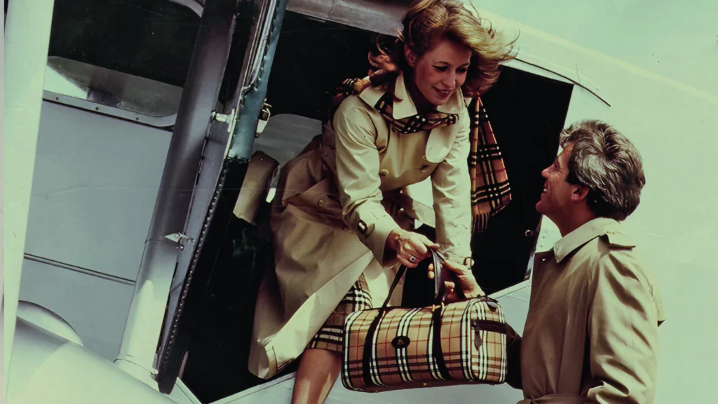
By the 1970s, the Burberry check scarf was formally introduced, woven in cashmere on traditional looms at a centuries-old Scottish mill. It quickly became one of the brand’s most enduring accessories. Portable, practical, and unmistakable, the scarf condensed Burberry’s identity into a single object.
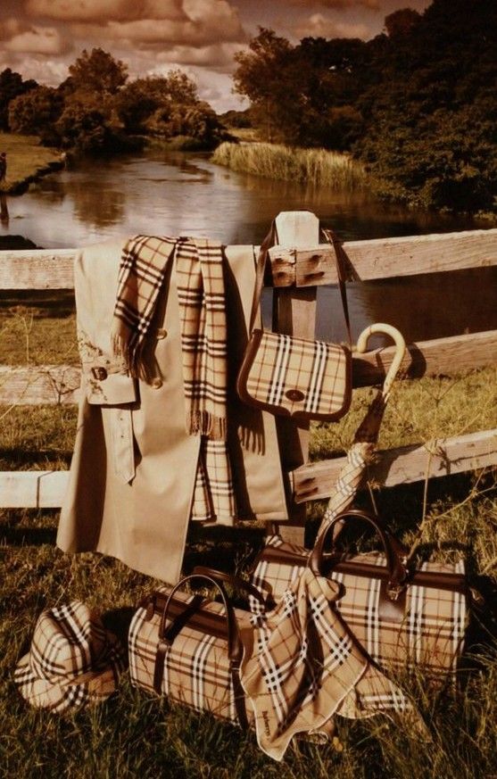
As the check moved outward, it moved into culture. It became woven into British visual life, from airport terminals to rainy high streets, from aristocratic estates to pop culture imagery. Unlike a logo, the check functioned as pattern rather than proclamation. Its recognisability relied on memory and repetition, not branding overture. That subtlety gave it power, but it also set the stage for tension.
Yet recognisability doesn’t guarantee endurance. In the early 2000s, the check exploded into global visibility, pulled into music culture, football terraces, and mainstream fashion alike. That ubiquity was double-edged: beloved by many, but at times so omnipresent that it risked eroding the very luxury hierarchy it once quietly signified. The ensuing years saw the pattern recast, pushed into different creative languages under successive designers, and sometimes receding from the centre of fashion’s conversation altogether.
Burberry’s creative leadership has spent the decades since navigating that balance. Christopher Bailey repositioned the check as a central fashion statement, amplifying its presence across collections and campaigns that romanticized British identity through a contemporary lens.
Riccardo Tisci’s tenure marked a decisive pivot. His reinterpretation introduced streetwear codes and global energy, remixing the check alongside oversized silhouettes and a bold new monogram. The shift was polarising, but purposeful. It reframed Burberry for a younger, international audience and proved that the check could survive transformation without losing its core identity.
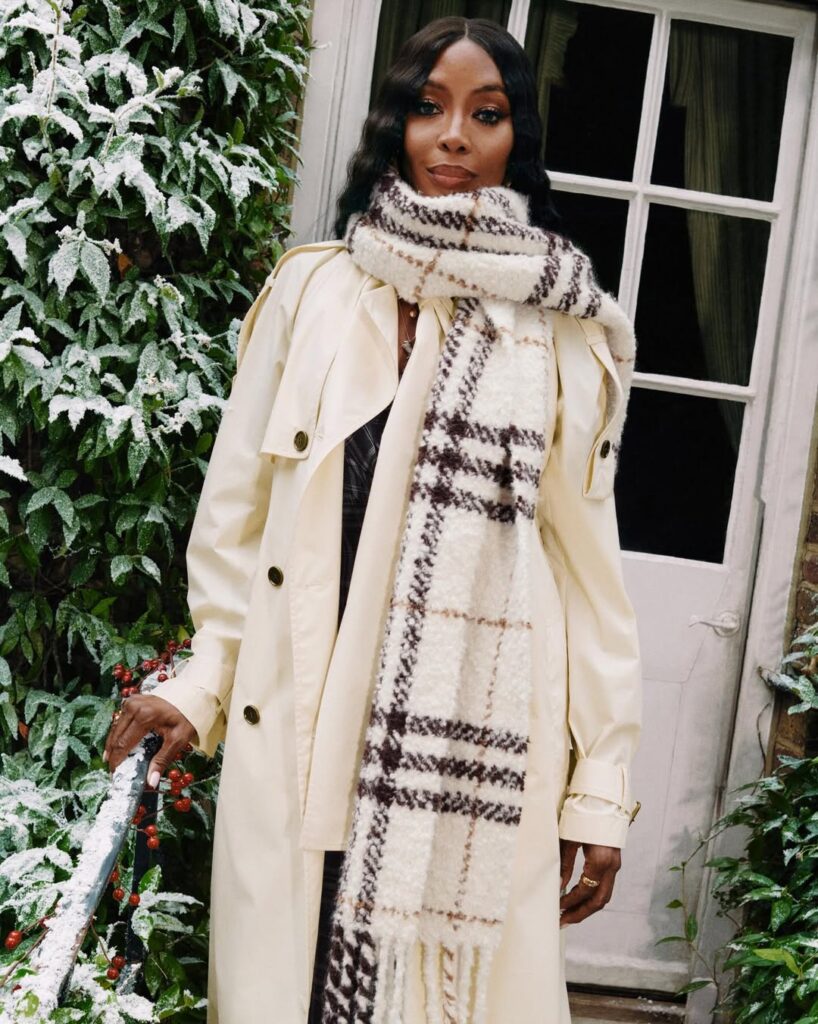
The current era under Daniel Lee sees the brand leaning back into Britishness with a steadier hand. Lee’s check appears softened, rendered in earthy tones like olive, rust, and oxblood. It is styled with intention rather than insistence. Campaigns place it in everyday settings, cafés, streets, festivals, grounding the pattern in lived experience rather than spectacle. The check feels less like a statement and more like a constant.
That shift has resonated. Burberry’s renewed presence in cultural conversation, from countryside activations to festival fields, suggests that the check’s relevance was never lost, only misaligned. Its return is not nostalgic, but corrective.
The enduring power of the Burberry scarf lies in this discipline. Each piece remains rooted in craft, woven slowly, designed to last. In a fashion industry driven by acceleration, the scarf’s longevity feels almost defiant. It does not chase attention. It earns recognition over time.
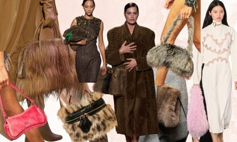
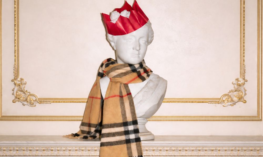
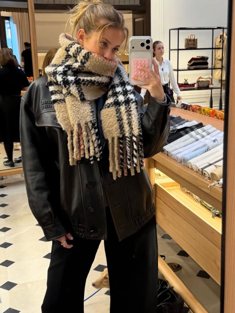
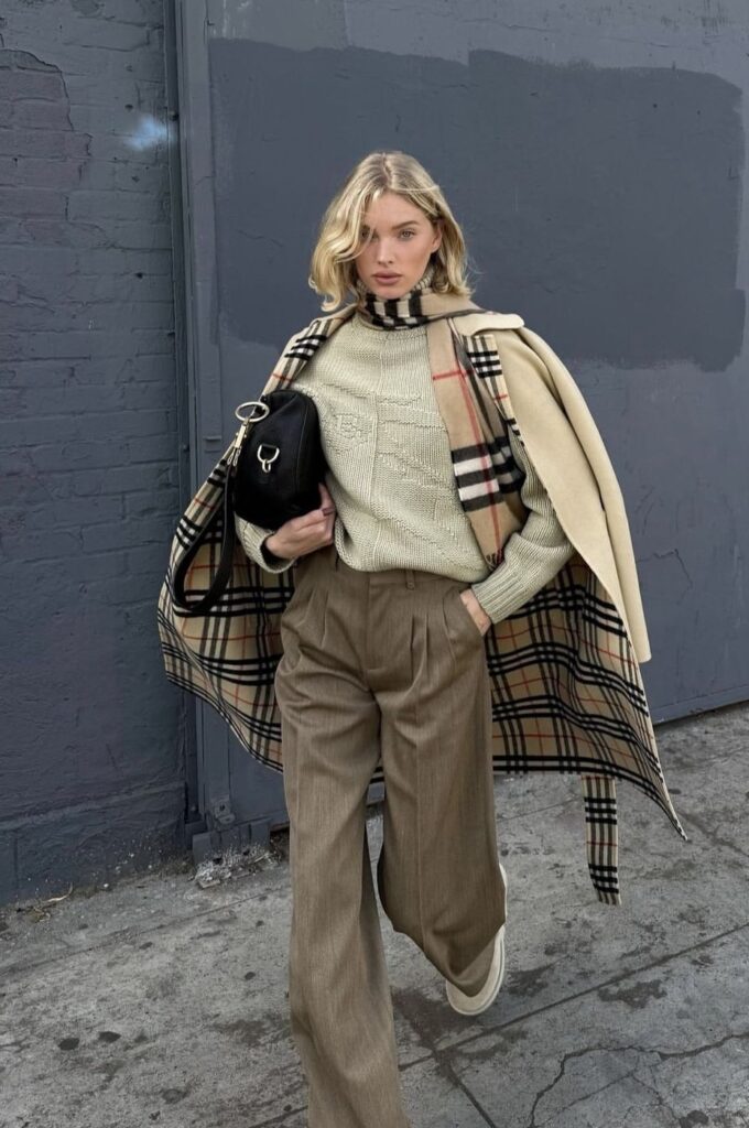
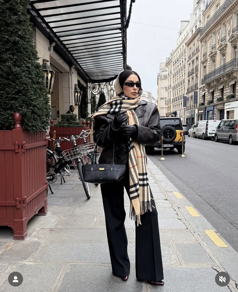
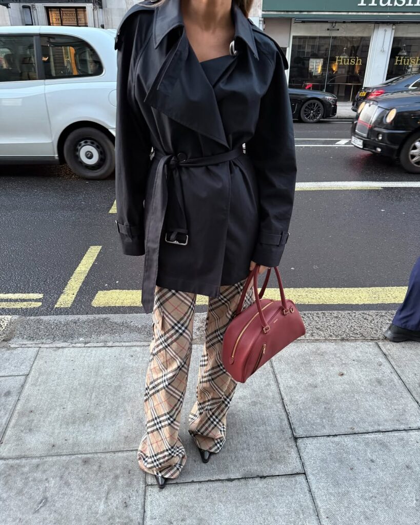
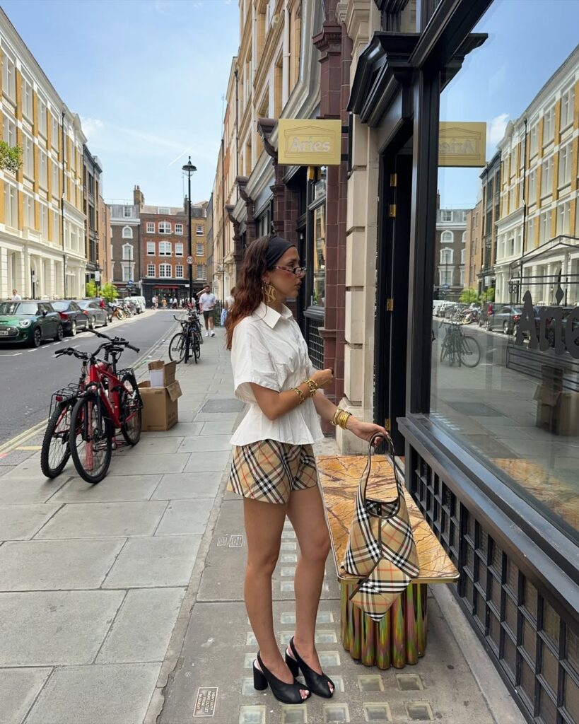
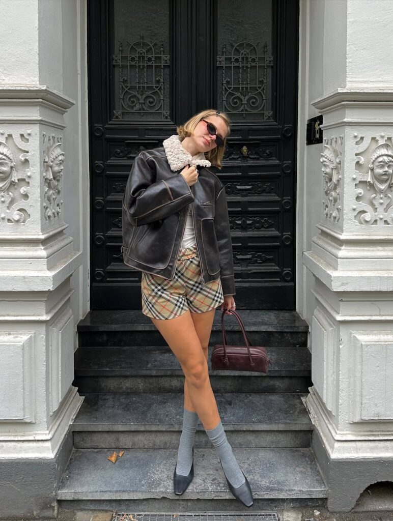
Now, the Burberry check has returned — and this time, it’s impossible to scroll past without seeing it. After a few years away from the limelight, the signature tartan appears to be splashed across social feeds of the fashion crowd. The “It” girls are incorporating the signature Burberry print into their wardrobes in the form of clothes, bags, and shoes, and accessories.
The signature Burberry print will only continue to grow in popularity in 2026. A timeless staple and an investment piece that will never truly fade away, the Burberry print promises a guilt-free trip to the mall. Before you swipe your card, here’s how the coolest girls are styling the iconic print.
ALSO READ: THE ULTIMATE FESTIVE GIFT GUIDE FOR THE MOST SPECIAL MEN IN YOUR LIFE.