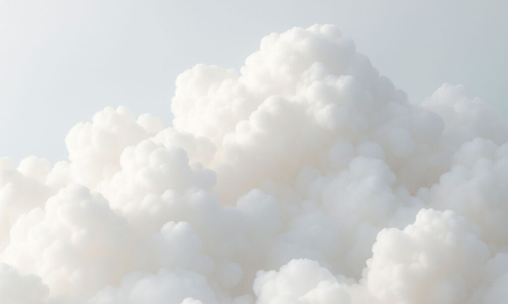
Every year, Pantone gives the world a mood to wear. Some years sparkle, some simmer, and some step in with a quiet kind of confidence that feels more powerful than noise. For 2026, the global color authority has looked beyond trend cycles and micro-moments and chosen something far more intentional. Say hello to Cloud Dancer, a soft, billowy white that arrives as a reset button for a world running on overdrive.
Cloud Dancer enters the cultural conversation at a moment when everyone is craving space to think, dream and build again. It reflects the desire for calm without dulling creativity, offering a fresh canvas that invites new possibilities rather than dictating a direction. Pantone describes it as a release from distractions. In practice, it feels like stepping into a room full of light and realizing your ideas suddenly have room to stretch.
Pantone is leaning into that creative energy this year. The institute is commissioning artists from across design, fashion and visual culture to interpret the color in limited-edition works. Illustrator Emiliano Ponzi opens the series with a special tote bag that translates the hue into his signature blend of conceptual depth and graphic clarity. Expect more collaborations to follow, each expanding how we see and experience this pared-back tone.
The 2026 color comes with an impressive roster of partners, each offering its own take on the shade. Motorola leads with a special edition of the ‘Motorola Edge 70’ finished in Cloud Dancer, matched with a quilted vegan-leather back and Swarovski crystal details. It is a study in balance and softness, meant to bring a little calm to the chaos of our digital lives.
Play-Doh joins the celebration with a Cloud Dancer edition of its iconic modeling compound. The brand frames this as a tool for creativity and ease, introducing a hue designed to quiet overstimulation and spark imagination. Post-it unveils the ‘Neutrality’ Collection with Cloud Dancer at its center, inviting clear thinking into workspaces and everyday routines. Command brand follows with a Cream Speckled collection inspired by the shade, encouraging free-form decorating without the commitment.
At home, Pura translates the color into fragrance, bottling the weightless feeling of Cloud Dancer as a scent meant to bring radiance and calm to every corner. Spotify introduces the first audio interpretation of a Pantone Color of the Year, curating a playlist inspired by the emotional temperature of the shade. Mandarin Oriental takes the idea global by infusing its hotels with Cloud Dancer-themed experiences, from afternoon tea to spa rituals and festive installations.
Furniture brand Joybird explores the tactile side of the color with new fabrics that turn simplicity into sensory comfort. Its Cloud Dancer upholstery spans everything from sectionals to accent chairs, encouraging interiors built around serenity and softness.
Fashion always responds to mood, and Cloud Dancer is ready to take center stage. It is a structural white that works across silhouettes, from crisp tailoring to plush outerwear. Designers are expected to explore its contrasting qualities: airy and grounded, quiet and expressive, minimal and textural. Think padded jackets that cocoon, chiffon dresses that float, jersey separates that move with ease and knits that wrap like a second skin.
Accessories will follow suit. The shade brings freshness to handbags, footwear and jewelry, offering a subtle sophistication that complements every palette. Expect soft natural fibers, polished hardware and sculptural pieces that play with the tension between simplicity and shine.
Beauty, too, gets its Cloud Dancer moment. The color offers a modern base for clean nail looks, high-contrast eye makeup and soft, luminous details. It works just as well for graphic shapes as it does for barely-there brightness.
Interiors embrace the hue in search of rest and clarity. Cloud Dancer encourages calm kitchens, spa-like bathrooms and living spaces built around openness and ease. As a structural neutral, it anchors bolder shades while maintaining visual breathability. In packaging and digital design, it reinforces a refined, modern identity that centers the product rather than the palette.
This is not a color that demands the spotlight. It holds it open for what comes next.
ALSO READ: BURO’S WEEKEND PLAYBOOK: 5 EXCITING THINGS TO DO IN DUBAI THIS WEEKEND.
